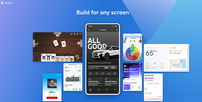

We've all wasted nights rebuilding buttons, grids, or forms. But here's the harsh truth: Flutter's ecosystem already has battle-tested solutions for 90% of your UI needs.
You're Here Because:
🧩You're planning a Flutter app and want to avoid UI debt from Day 1
🕒R
After rescuing 7 projects from flutter UI chaos, I discovered three libraries that let you: ✅ Slash UI development time by 60% ✅ Enforce design consistency across teams ✅ Reclaim coding hours for actual business logic
1. GetWidget — A Comprehensive, One-Stop UI Toolkit
GetWidget is a powerful, open-source Flutter UI library that offers over 1,000 ready-to-use widgets. It includes buttons, lists, navigation bars, or other common interface elements. For newcomers, it is like LEGO bricks and snap together professional interfaces without reinventing the wheel.
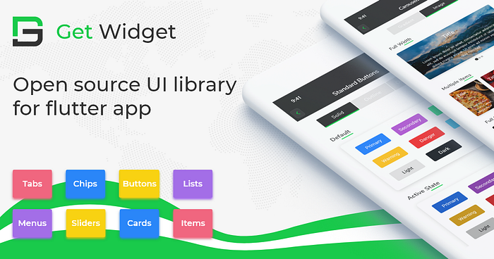
When to Use It? If you're building similar common apps layouts (e.g. login forms, settings screens), GetWidget provides instant solutions out of the box. It is perfect for cross-platform projects.
// Add the dependency into pubspec.yaml file
dependencies:
  getwidget: ^2.0.4

// You can easily build flutter cards with simple codes.
import 'package:getwidget/getwidget.dart';

GFCard(
 boxFit: BoxFit.cover,
 image: Image.asset('your asset image'),
 title: GFListTile(
   avatar: GFAvatar(
     backgroundImage: AssetImage('your asset image'),
   ),
   title: Text('Card Title'),
   subTitle: Text('Card Sub Title'),
),
content: Text("Some quick example text to build on the card"),
buttonBar: GFButtonBar(
 children: <Widget>[
   GFButton(
    onPressed: () {},
    text: 'Buy',
   ),
   GFButton(
    onPressed: () {},
    text: 'Cancel',
   ),
 ],
 ),
),
Key Advantages
🚀Instant usability: You can dive right in — minimal learning curve and zero hassle
📖R
2. Bruno — Elegant UI Solution by Beike Corp
Bruno is a beautifully designed open-source Flutter UI toolkit developed by Beike Corp (China's $30B real estate platform), specifically crafted for rapidly creating business-oriented or enterprise applications.
// Add the dependency into pubspec.yaml file
dependencies:
  bruno: ^3.4.3

// You can easily create business-oriented bottom tab bar with codes
var titles = ['One', 'Two', 'Three', 'Four', 'Five','Six'];
BrnBottomTabBar(
  fixedColor: Colors.blue,
  currentIndex: _selectedIndex,
  onTap: _onItemSelected,
  badgeColor: Colors.red,
  items: <BottomTabBarItem>[
    BottomTabBarItem(
      icon: Image(image: AssetImage("assets/icons/navbar\_fangyuan.png")),activeIcon: Image(image: AssetImage("assets/icons/navbar\_fangyuan.png")), title: Text(titles[0])),
    BottomTabBarItem(icon: Image(image: AssetImage("assets/icons/navbar\_fangyuan.png")), title: Text(titles[1])),
    BottomTabBarItem(icon: Image(image: AssetImage("assets/icons/navbar\_fangyuan.png")), title: Text(titles[2])),
    BottomTabBarItem(
      icon: Image(image: AssetImage("assets/icons/navbar\_fangyuan.png")),
      activeIcon: Image(image: AssetImage("assets/icons/navbar\_fangyuan.png")),
      title: Text(titles[3])),
    BottomTabBarItem(icon: Image(image: AssetImage("assets/icons/navbar\_fangyuan.png")), title: Text(titles[4])),
    BottomTabBarItem(icon: Image(image: AssetImage("assets/icons/navbar\_fangyuan.png")), title: Text(titles[5])),
  ],
)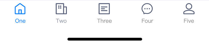
Key Advantages 🌟 Rich business components: Includes form validations, dialogs, lists and more ⚡ Rapid prototyping: Pre-designed components reduce UI development time 📱 Consistent multi-platform design: Optimized for smooth performance on both Android and iOS.
3. VelocityX — Responsive UI and Easy State Management
VelocityX is an innovative Flutter UI toolkit emphasizing responsive design, making it easy to build adaptive UIs for web and mobile. It includes convenient built-in responsive utilities and a simplified state management solution, perfect for small-scale projects.
// Add the dependency into pubspec.yaml file
dependencies:
    velocity_x: ^3.3.0

// You can create adaptive flutter ui box with velocityX codes
import "package:velocity_x/velocity_x.dart";
Widget build(BuildContext context) {
  return VxBox(child: Text("VelocityX")).red500.make().centered();
}
Key Advantages 🎯 Responsive by design: Easily build adaptive layouts without external complexity 🔧 Built-in handy tools: Includes padding, margins, typography adjustments, and more ⚙️ Simple state management: Comes integrated with basic state management, ideal for small to medium projects
Flutter Material 3: The Next Evolution in UI Design
If after exploring third-party toolkit you're still leaning towards Flutter's native UI capabilities, then Material 3 (also known as Material You) is your best bet. Material 3 is Google's latest design specification, officially released alongside Android 12. It introduces dynamic color schemes, adaptive theming, modernized UI components, and significant improvements in interactivity.
theme: ThemeData(
  primarySwatch: Colors.blue,
  useMaterial3: true, // set true to enable material3
),

// You can create flutter material3 component
import 'package:flutter/material.dart';
void main() => runApp(const MyApp());

class MyApp extends StatelessWidget {
  const MyApp({super.key});

  @override
  Widget build(BuildContext context) {
    const String appTitle = 'Flutter layout demo';
    return MaterialApp(
      title: appTitle,
      home: Scaffold(
        appBar: AppBar(title: const Text(appTitle)),
        body: const Center(
          child: Text('Hello World'),
        ),
      ),
    );
  }
}Key Advantages 🎨 Unified Google Design Language Material 3 aligns your app's UI closely with Android 12's system interfaces and Google's own applications, and creates seamless interactions across different devices 🌐 Official Support and High Stability Material 3 enjoys long-term maintenance from Google's Flutter team. This ensures continuous updates, excellent compatibility, and high stability ✨ Modernized Components Material 3 updates many familiar UI elements, providing cleaner, more intuitive versions of buttons, cards and more.
🚩Wrapping Up: Picking the Right Flutter UI Toolkit for Your Next App
Choosing the right UI toolkit can set the tone for your entire project, so here's a quick guide to help you decide: 🏗️ GetWidget is your go-to option if you need a vast collection of ready-made widgets for rapid prototyping and efficient development. 💼 Bruno shines if you're developing professional, elegant, business-oriented apps — especially ideal for teams who prefer consistency and enterprise-grade UI quality. 📐 VelocityX is perfect for small- to medium-sized projects that value responsive design and appreciate built-in state management without complexity. 📱RIfyou prefer sticking with Flutter's built-in, officially supported option, Material 3 gives you Google's latest design standards right out of the box.
Ultimately, the best toolkit depends on your app's specific goals, team preferences, and target audience.
💬 Your Turn
Have you tried these toolkit in projects, or do you have another favorite Flutter UI toolkit? Leave a comment below and share your experience — let's help each other build amazing Flutter apps together!
Happy coding :)